Call Us
For Sales Inquiry
-
 +1 214 447 0720
 -
 +973 80019713
 -
 +91 8141301021
(If we don’t pick up, drop inquiry. We will contact you.)
Call Us
For Sales Inquiry
- +1 214 447 0720
- +91 8141301021
(If we don’t pick up, drop inquiry. We will contact you.)
We Help Businesses
Empower people through technology and innovative solutions

20 Ways to Make Ideal Mobile e-Commerce Checkout Page in 2018
May 21, 2018
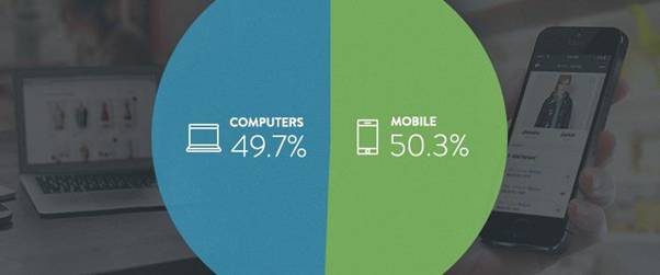
You must have found a lot of articles and research done on the ideal desktop e-commerce checkout page but a very limited study on mobile eCommerce checkout page. According to Shopify 50% of the traffic comes from mobile devices
People using mobile for eCommerce checkout is almost equal to the desktop usage, in fact minimally more. Therefore, it is important for us to make an ideal e-commerce checkout page, more responsive themes for better customer experience.
1) Designing for Fingers, Touch, People and Not the Mouse
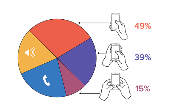
UX Professionals conducted many user research and came with few guidelines when designing for mobile devices. From the data collected, they found the behavior that how the user hold and interacts with the phone. The observation was that the users held their phone in three basic ways:
- One-handed- 49%
- Cradled- 36%
- Two-handed- 15%
We observed that most of the people are touching their screen using one hand, very large numbers of people also used different methods. The least-used case was two-handed use and is large enough to consider it during design.
However, This is just an approximate and depend on the individual to individual. I have observed cases where an individual is casually scrolling with one hand, then using two hands to type. Similar interactions are very common and can’t be generalized.
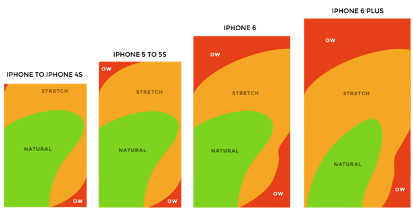
Hoober’s research created a Thumb Zone heat map representing the most common use case:
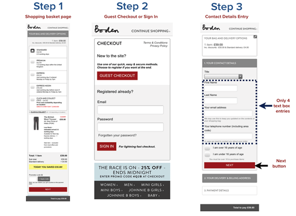
2) Break up checkout page into multiple pages.
We have found that users are uncomfortable when it entering details on mobile and therefore we must keep the checkout page as simple as possible with a minimum number of fields required.
3) Get Shoppers through checkout as easily and quickly as possible
One of the common assumptions we make when designing mobile e-commerce is that users expect poorer performance when compared to desktop. From my experience, I’ am telling you that users expect pages to load as fast as possible.
Often users are observed to abandon their carts due to poor e-commerce experiences which can be avoided by facilitating users by providing information they require the most. The checkout behavior analysis in Google Analytics will help you determine where the visitor dropped off during the checkout process. This will help you optimize your user’s path towards and during the checkout process.
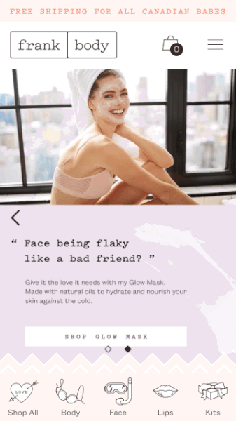
One way to practice this is to include all the important information the customer may want to know during the checkout process. For example, when I visit this online boutique to buy a gift for somebody (a crop top), here is what I experience once I’ve chosen which crop top I want to buy:
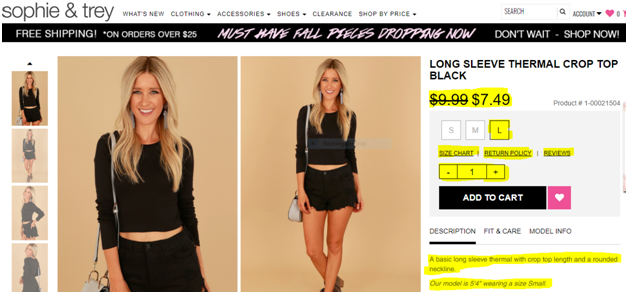
- Original price AND discounted price
- The options like Size Chart, Return Policy, Reviews are all there to help me make an informed decision
- The size of the product along with showing the unavailable sizes. If the person I am getting the gift for is small or a medium for example, I will not proceed and my time and energy will be saved
- Product description AND the height of the model wearing it (so I can compare it against the height of the person I am buying it for)
Here I have listed out few things which you must consider for faster mobile checkout.
- Place tab Next/Previous tabindex to enable shoppers to move between input fields.
- Avoid placing two or more fields in a single row.
- Auto-fill support.
- Bigger buttons.
- Numeric keyboards wherever required.
- Offer guest checkout.
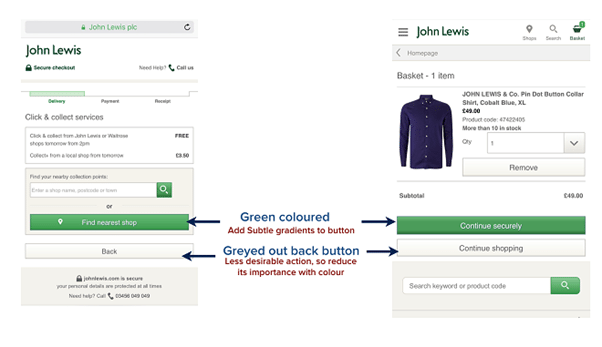
4) Add some subtle gradient to call to action(CTA) buttons
Ensure that the only colored button on the checkout is the call to action button making it tempting to press. Use lighter colors for less priority CTA and darker colors for important ones.
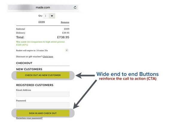
5) Make your end to end buttons big
It’s one of the design principles which we follow so that it is easy for users to touch their targets.
Ensure that checkout, guest checkout, next button or other CTA are big enough and at least 44 pixels.
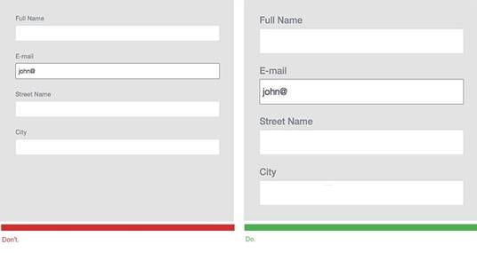
6) Bigger Text Fields
It is important for you all to understand the data input from users and make it as easy as possible. Help icons or text about what information has to field which good touch response will significantly increase the overall UX.
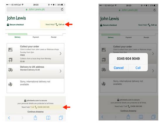
7) Click to Call
On the off chance that you just offering shoppers the choice to fill out a form to get in touch with you, you’re really demoralizing shoppers that could prompt a deal and offering poor customer service.
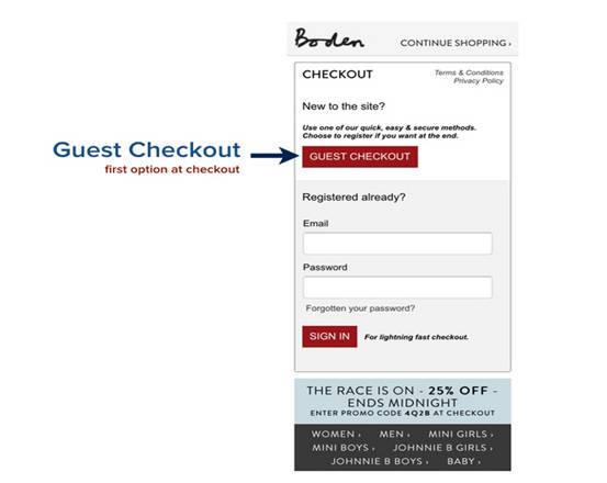
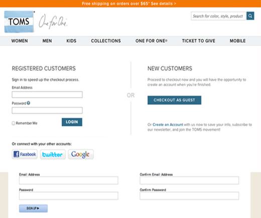
8) Guest Checkout
Many shoppers don’t like filling up a registration form to purchase a product and the number of these kinds of shoppers is in a quite considerable number. This may result in the big loss in your sales.
9) Persistent checkouts
It is better to offer persistent cart options, it will send a message to the shoppers who have added their items to the shopping cart but didn’t proceed to checkout. Using this you can avoid cart abandonment.
Related Article: ECommerce Security: 7 Ways To Protect E-Commerce Customer Data
You can make the shopping cart persist for certain days to help shoppers to make their purchase. A persistent shopping cart is the only way to retrieve information from a previous session for guest shoppers.
10) Use Expandable Menus
Accordions will help in hiding content as well as you won’t have to provide link for certain information. This will help in reducing distraction of customers on the checkout page.
11) Ensure that right keyboard is triggered
What I have found that shoppers don’t like typing much on the mobile as it is little bit difficult then entering the information on desktop. Input fields in checkout can be text as well as numeric.
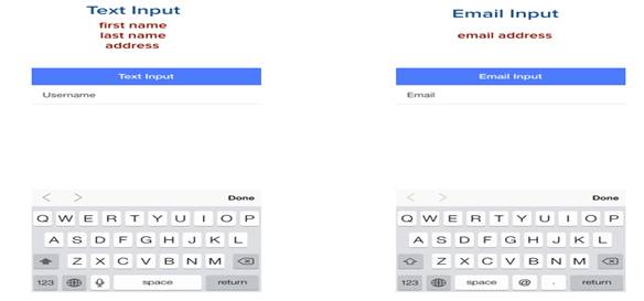
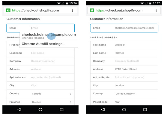
12) Auto Detect and Auto Complete
Auto fill or auto complete is provided by two major mobile web browser Safari Mobile and Chrome.
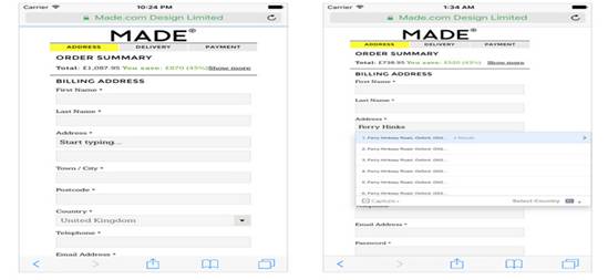
13) Address Finders
Including an address finder a portable checkout page chops down a lot of time required to enter a full address.
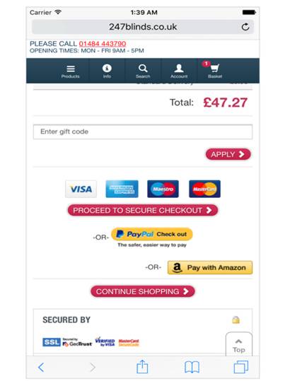
14) Single Click Express Checkout Payment Options
There are many new shoppers who are not convinced in giving the credit card details to the ecommerce stores. They better prefer to go for PayPal checkout or use the username and password of their PayPal for checkout process.
15) Extended Validation SSL Certificates
While going through the checkout process you must have seen a green bar assurance. SSL is not enough for making the shoppers feel secured. You must provide them some security features so that they are assured to their data security.
Related Artice: 7 Things You Must Know To Increase Sales Of Your ECommerce Store In 2018
Extended Validation Certificate is more intensive then the basic SSL and displays a green assurance bar with your company name giving a sense of security to the users.
16) Use top navigation menu
When people check your website it is important that they are able to explore plenty of other options which are readily available. Your primary navigation is a place to start telling people and search engines what you offer.You can decrease your bounce rate, if your navigation is at the right position with all the necessary contents.
17) Anticipate Omni-Channel into Mobile Commerce
My observations is that omni-channel shoppers cherished utilizing the retailer’s touchpoints, in a wide range of mixes and places. Not exclusively did they utilize mobile app to compare about costs or download a coupon, yet they were additionally devoted customers of in-store tools.
These omni-channel procedures have spun around in-store applications. The demand of ecommerce mobile store stretches out before your customers venture inside.
18) Don’t Force Sign-in Before Checkout
Kissmetrics have observed thatone third of the online shoppers don’t make it past the first step of checkout. You must give shoppers the option to cling on to any information that isn’t necessary to the end purchase.
19) Design Experiences Instead of Forms
You do need to always take inputs from users to let them purchase. What I have seen that most of the customers prefer tapping rather than typing, it can make a mobile site more interesting and more engaging to interact with
The site normally collects complex bits of data. The most of the information can be entered without the user having to mess with their keyboard by using point and click. It will make the users work less and more enjoyable.
20) Test across Systems and Setups
You also know that there are lots of operating systems therefore mobile testing and testing at multiple resolutions is important. You mustget your hands on each OS. It can be an invaluable allowing you to switch between different OS.
Conclusion:
The summary is that keep the process short and if you can’t make multiple pages. Use accordions instead of links which takes to some distant page. You must be clear in how many steps is needed to checkout.
Make it simple by minimizing the amount of fields needed. Avoid using those fields that isn’t necessary when checking out or creating an account. Make sure the checkout process is easy, fast and secured.
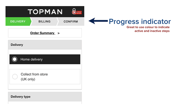
Make use of guest checkouts, progress indicators and accordions to communicate clarity the time for the checkout. This will give your customers a sense of security easing their experience.
Get more stuff like this
in your inbox
blog

December 11, 2017
10 Ecommerce Product Optimization Tips Boost Your Conversion by 200%
Running E-commerce site means putting extra efforts. How to fetch the attention of customers...

November 9, 2017
12 eCommerce Trends That You Must Know To Dominate In 2018
Running E-commerce site means putting extra efforts. How to fetch the attention of customers...
April 26, 2018
10 Payment Security Measures to Deal E-commerce
Running E-commerce site means putting extra efforts. How to fetch the attention of customers...
Certifications and
Featured In


✖
Get this insight in your mail box
✖
Hire our developer
✖
Request Demo
✖
Get a perfect quote
Get latest update on IoT, eCommerce
and Mobile application!
and Mobile application!

We respect your privacy. Your information is safe and will never be shared.

Don't miss out. Subscribe today.